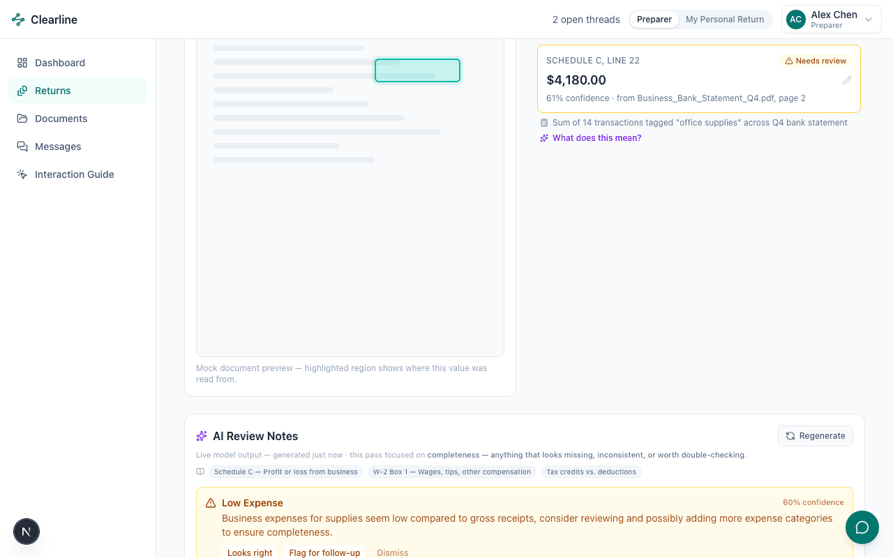
Source Document Traceability
See exactly where every number on the return came from.
Click any extracted value to see its source document highlighted — down to the exact page and region, plus the calculation trail for anything that isn’t a direct copy.
Review Bob Johnson’s return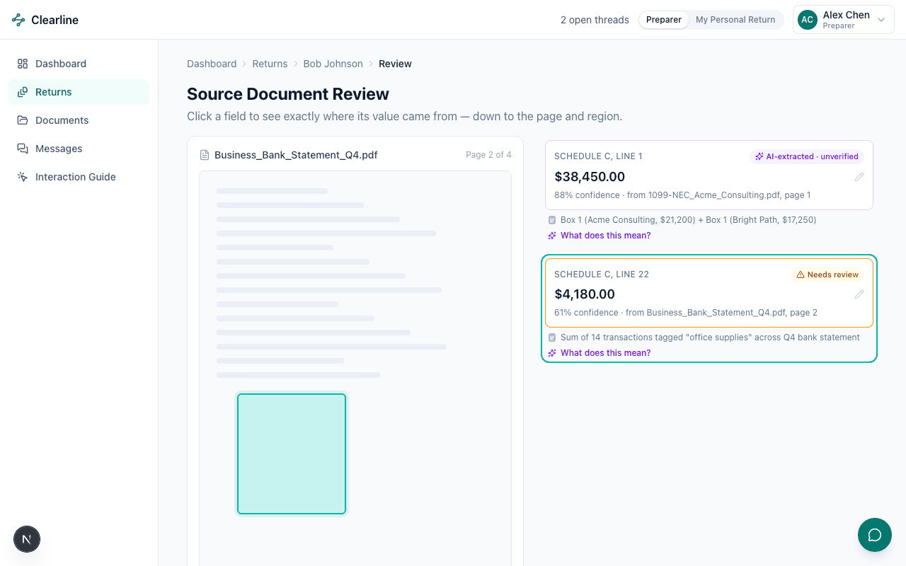
Client & CPA Collaboration
Conversations stay attached to the document or issue they’re about.
Messages are tied to specific documents and tasks. Internal firm notes are visibly marked and structurally excluded from anything a client persona can load — not just hidden with CSS.
Open the internal thread on R002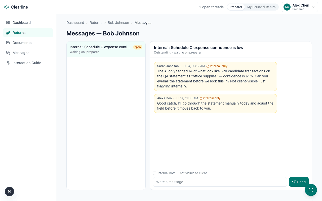
Where to Start
New clients get one clear next step, not a wall of navigation.
A brand-new client is dropped straight into a focused, three-step flow — no sidebar, no dashboard, one task at a time — instead of the full product on day one.
Auto-triggers on first login — switch persona in the avatar menu, top right.
Switch to Sam Rivera to see it live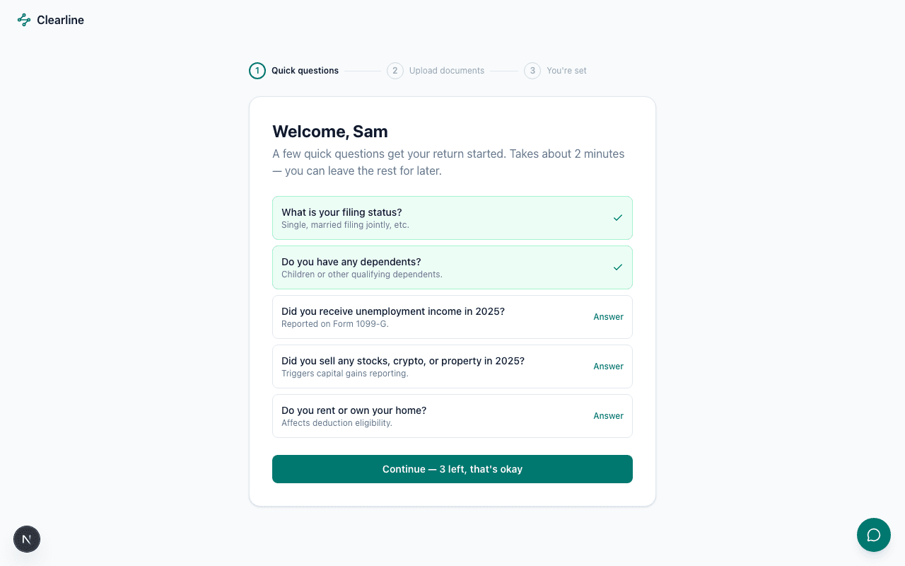
Getting Lost in the App
Never lose your place moving between documents, tasks, and messages.
Breadcrumbs use real names, not IDs, and the Related panel keeps every document, open task, and thread on a return one click away, no matter where you navigated in from.
Open Jane Smith’s return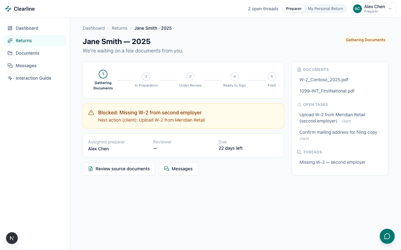
Role-Aware Experiences
The same product, reshaped for whoever’s using it.
Same shell, same components — completely different sidebar, dashboard, and permissions depending on who’s logged in. Compare this client view against the dashboard further down the page.
Compare personas from the avatar menu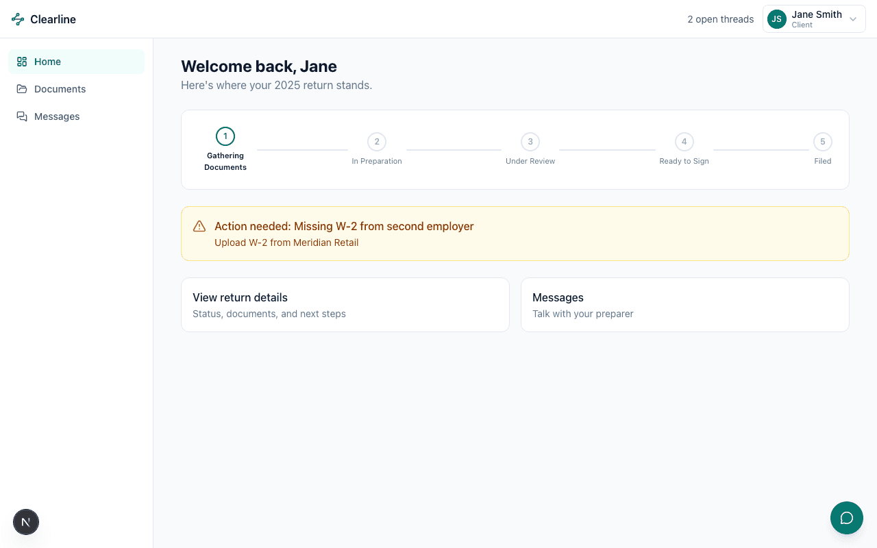
Return Status & Progress
A status everyone reads the same way, client and staff alike.
One status field, two renderings: a five-stage plain-English timeline for clients, a detailed status badge for staff — always in sync, never two sources of truth.
View as Jane Smith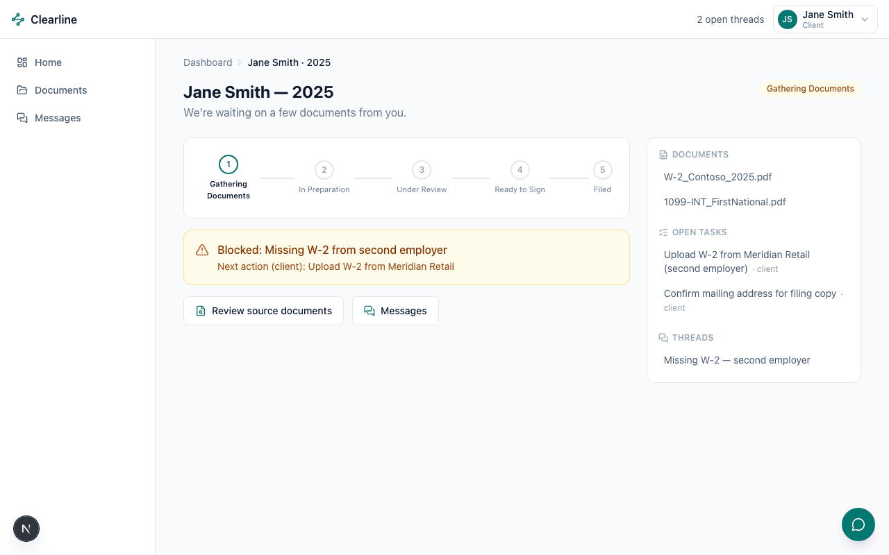
An Actionable Dashboard
Always know what to work on next.
Returns ranked by a real scoring function — overdue beats blocked beats "it’s your turn" beats due-this-week — not just sorted by date.
View the Preparer dashboard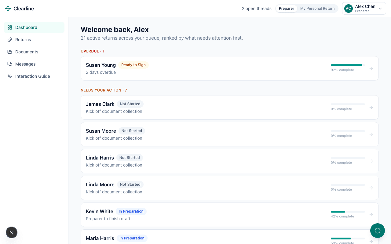
Clickable vs. Editable
One consistent way to tell what you can touch, and what you can’t.
One component, six states — editable, AI-extracted, verified, flagged, locked, pending approval — used identically on this legend page and on the live review screen.
Open the Interaction Guide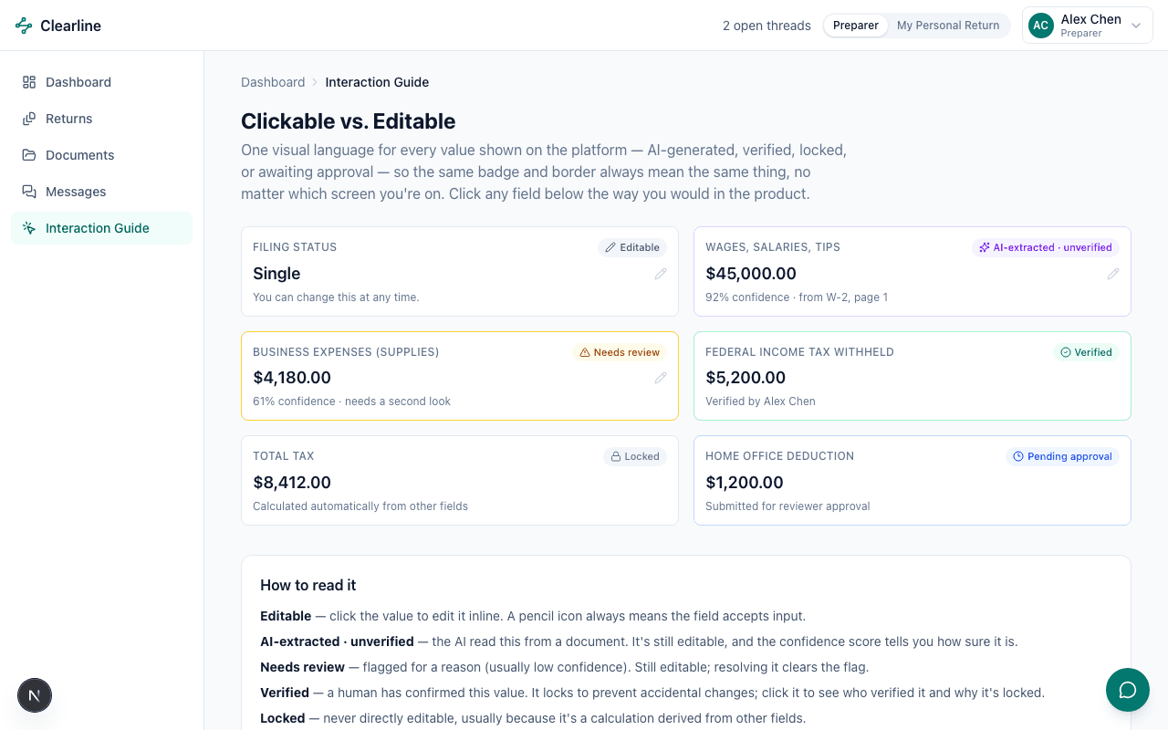
Complexity Made Navigable
Hundreds of documents, still easy to find what you need.
Around 260 generated documents, with search, a type filter, and collapsible group-by-client — proving the pattern holds at volume, not just against five demo rows.
Browse all documents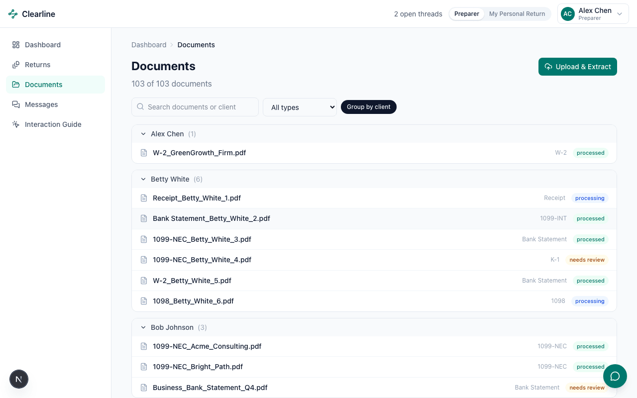
Trustworthy AI
AI you can actually verify, not just trust blindly.
A live Groq call reasons over the return’s data, grounded by a retrieval step over a small knowledge base — sources shown, confidence scored, and nothing applies without a human confirming it.
Generate live review notes